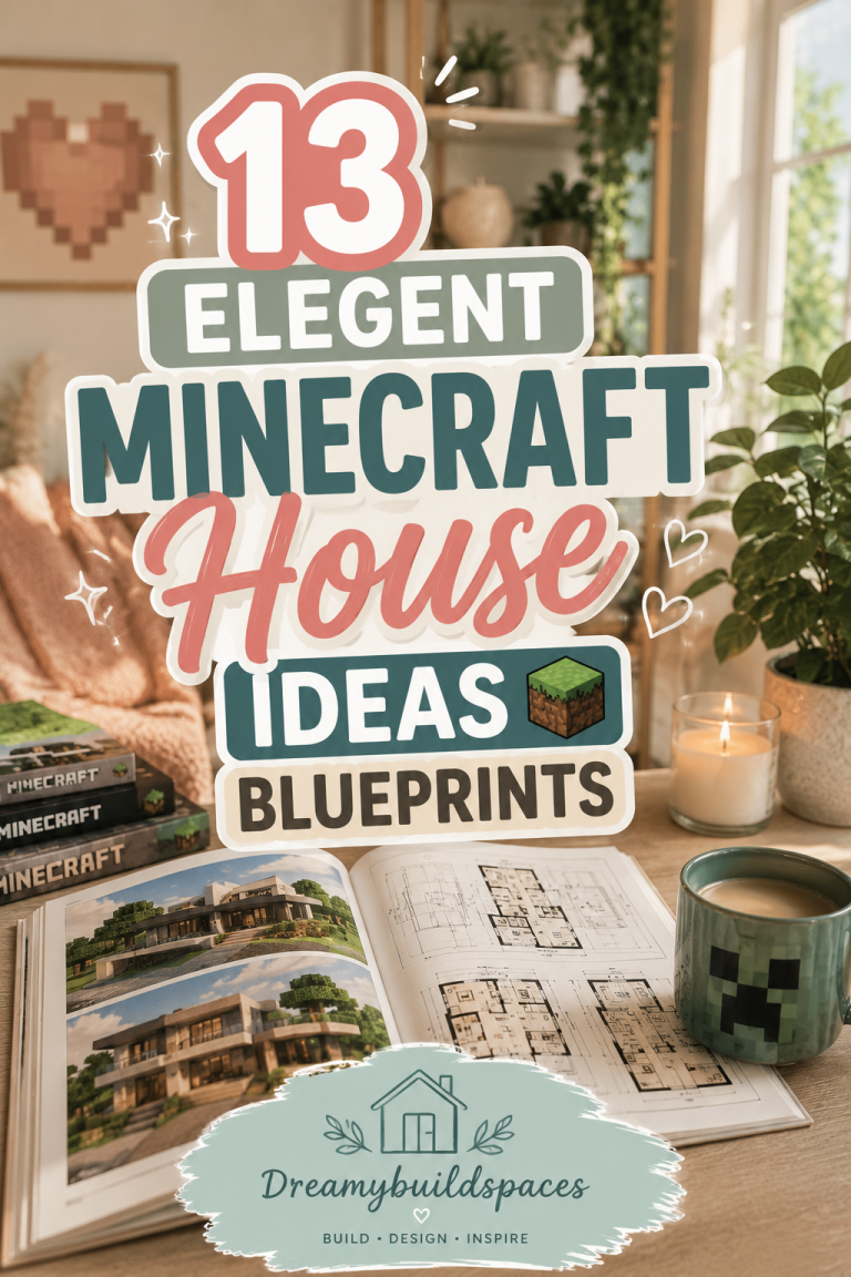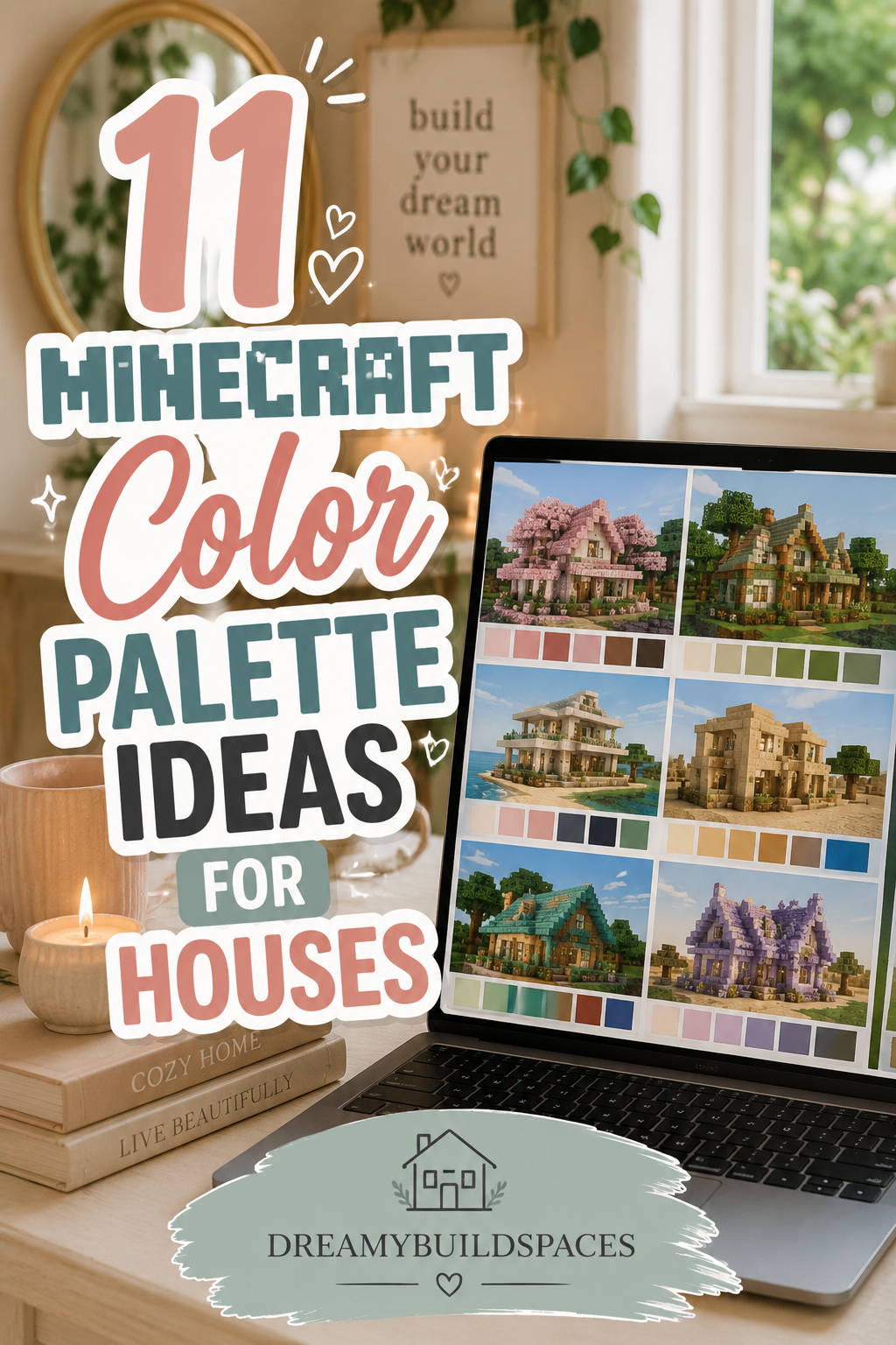
11 Minecraft Color Palette Ideas For Houses
Choosing the right color palette in Minecraft is one of the most important steps in building a visually stunning house. While structure and shape define the layout, colors define the mood, personality, and overall aesthetic of your build. A well-planned color palette can turn a simple house into a beautiful, eye-catching creation that feels professional, cohesive, and immersive.
In Minecraft, every block you place contributes to the overall visual story of your build. Unlike real life, where paint and materials can be changed easily, Minecraft requires you to carefully plan your color combinations before and during construction. This is why understanding color palettes is essential for every builder, whether you are creating a survival base, a modern mansion, or a cozy cottage.

A strong color palette helps bring harmony to your house. When colors work together properly, even simple builds look polished and intentional. On the other hand, random or mismatched colors can make even large and detailed houses feel messy or unfinished. That is why professional Minecraft builders always start with a clear palette before placing the first block.
There are many different types of Minecraft house aesthetics, and each one relies on specific color combinations. For example, modern houses often use whites, grays, and blacks to create a clean and minimal look. Rustic or medieval builds rely on earthy tones like browns, stone grays, and deep greens to create a natural and aged atmosphere. Fantasy builds, on the other hand, often use vibrant and magical colors like purples, blues, and glowing accents to create an otherworldly feel.
Lighting also plays a big role in how color palettes appear in Minecraft. The same blocks can look completely different depending on whether they are placed under sunlight, torchlight, or glowstone lighting. This is why combining colors with the right lighting style can dramatically enhance the mood of your house.
Another important factor is texture. Minecraft blocks are not just flat colors—they come with patterns and details. For example, stripped wood, stone bricks, and concrete all have different visual textures that affect how colors blend together. A good palette considers both color and texture balance to avoid visual overload.
When selecting a palette, it is also important to think about contrast. High contrast builds use strong differences between light and dark colors to make structures stand out. Low contrast builds, on the other hand, use soft, similar tones to create a calm and blended appearance. Both styles can look beautiful when used correctly.
These 11 Minecraft color palette ideas are designed to help you create more visually appealing and professional-looking houses. Each palette is carefully chosen to match different building styles, moods, and environments. Whether you prefer cozy cottages, modern villas, fantasy castles, or rustic survival homes, you will find inspiration here to elevate your building skills.
By understanding and using the right color combinations, you can transform your Minecraft world into a cohesive and aesthetically pleasing environment. Every block will feel intentional, every structure will feel balanced, and every house will tell its own unique visual story.
Now let’s explore these 11 powerful Minecraft color palette ideas that will completely upgrade your building style and help you create stunning houses in any world.
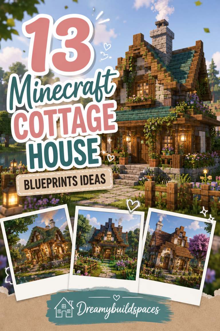
Idea 1: Cozy Cottage Warm Palette — Brown, Cream & Soft Green Harmony
The cozy cottage warm palette is one of the most comforting and naturally balanced color combinations you can use for Minecraft houses. It is inspired by countryside cottages, forest cabins, and soft natural environments where warmth and simplicity define the entire aesthetic. This palette focuses on creating a home that feels peaceful, lived-in, and visually soft.
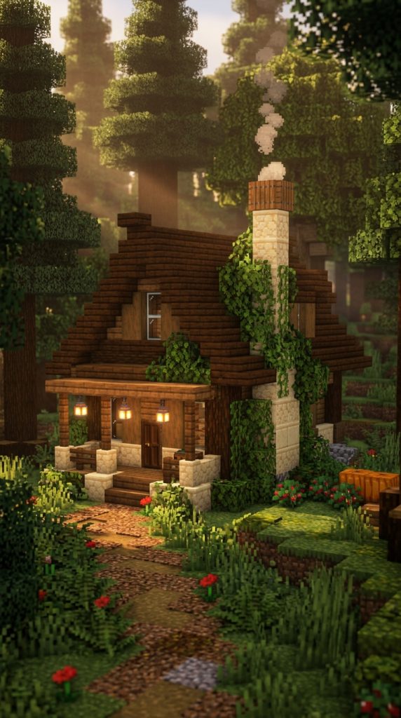
The main idea behind this palette is natural comfort. Instead of bright or artificial colors, it uses earthy tones that blend smoothly with nature. This makes it perfect for survival houses built in forests, plains, or flower biomes. The colors feel organic and timeless, which helps the build stay visually appealing in any environment.
The foundation of this palette is brown tones, which are usually represented through wood blocks. Oak, spruce, and dark oak wood create the structural base of the house. These materials give the build a strong natural identity and make it feel grounded.
Cream and off-white tones are used to soften the structure. Blocks like white wool, calcite, or smooth quartz help balance the darker wood tones. These lighter colors make the house feel brighter and more inviting, especially during daytime lighting.
Soft green accents bring life into the palette. Greenery such as leaves, vines, moss, or plant decorations add freshness and make the house feel connected to nature. This small touch of green prevents the build from feeling too heavy or monotone.
Lighting plays a subtle but important role in this palette. Warm lanterns, candles, or soft glow sources enhance the cozy feeling without overpowering the natural tones. The goal is to create a warm glow rather than a bright artificial shine.
Block Palette Breakdown
- Oak wood and spruce wood
- Stripped logs for texture variation
- Cobblestone and stone bricks
- White wool or calcite for cream tones
- Leaves and vines for green accents
- Mossy stone blocks for natural aging
- Lanterns for warm lighting
- Wooden planks and stairs
- Dirt paths and coarse dirt
- Glass panes for soft windows
These blocks create a balanced cottage-style aesthetic.
How to Use This Palette in a House Build
Step 1: Build the Wooden Structure
Start with oak or spruce logs as the main frame of your house.
Step 2: Add Stone Foundations
Use cobblestone or stone bricks for a strong base layer.
Step 3: Introduce Cream Highlights
Add white or light blocks between wood sections for contrast.
Step 4: Decorate With Greenery
Place leaves, vines, and small plants around the structure.
Step 5: Add Warm Lighting
Use lanterns around doors, windows, and pathways.
Styling Tips
This palette works best when you avoid overloading colors. Let wood remain dominant, and use cream and green only as supporting tones. The goal is a calm, cozy, and natural-looking home that blends beautifully with its surroundings.
Idea 2: Modern Minimal Palette — White, Gray & Black Clean Design
The modern minimal palette is a sleek and structured color combination designed for clean, elegant Minecraft houses. It is inspired by modern architecture, luxury homes, and minimalist interior design. This palette focuses on simplicity, symmetry, and sharp visual clarity.
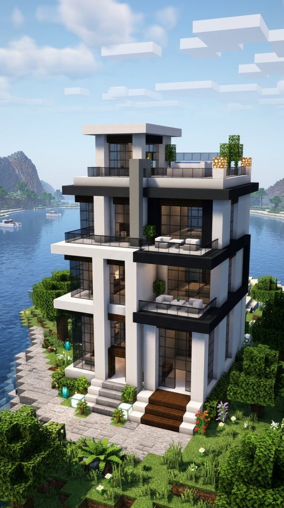
The main idea behind this palette is controlled simplicity. Instead of using many colors, it relies on neutral tones that create a clean and professional appearance. This makes it ideal for modern villas, city houses, and futuristic builds.
White is the dominant color in this palette and represents openness, cleanliness, and space. Blocks like white concrete or quartz are commonly used to build walls and main structures. These blocks create a smooth and polished surface that defines the modern aesthetic.
Gray tones add depth and structure. Light gray and stone-based blocks are used to break up large white surfaces and prevent the build from feeling too flat. They help create architectural definition without adding visual clutter.
Black accents are used sparingly but effectively. They highlight edges, frames, and structural details such as window borders or roof lines. This contrast gives the house a strong and stylish appearance.
Glass is also a key material in modern builds. Large glass panels or windows create openness and allow natural light to enhance the clean design. This transparency is a signature feature of modern Minecraft architecture.
Block Palette Breakdown
- White concrete or quartz blocks
- Light gray concrete
- Smooth stone or andesite
- Black concrete or blackstone
- Glass panes or glass blocks
- Iron blocks for accent details
- Stone slabs and stairs
- Polished diorite for clean texture
- Sea lanterns for modern lighting
- Minimal wood accents (optional)
These blocks create a clean modern architectural style.
How to Use This Palette in a House Build
Step 1: Create a Simple Geometric Structure
Start with clean rectangular or cubic shapes.
Step 2: Build White Base Walls
Use white concrete or quartz for the main structure.
Step 3: Add Gray Structural Layers
Insert gray blocks to create depth and separation.
Step 4: Apply Black Accent Lines
Highlight edges, windows, and corners with black blocks.
Step 5: Add Glass and Lighting
Use large glass panels and hidden lighting for a polished finish.
Styling Tips
This palette works best when you maintain balance and avoid over-decoration. The beauty comes from clean lines, symmetry, and controlled contrast rather than complexity.
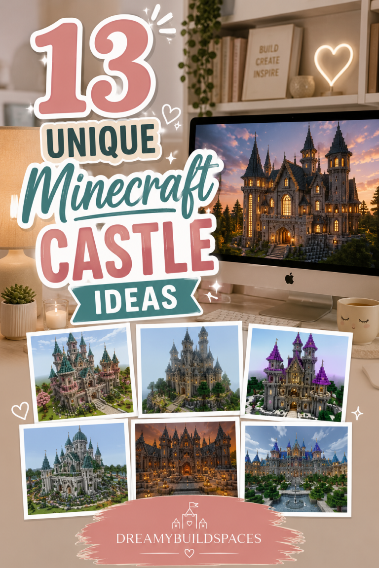
Idea 3: Fantasy Magic Palette — Purple, Blue & Glowing Crystal Theme
The fantasy magic palette is a vibrant and imaginative color combination designed for magical Minecraft houses, enchanted castles, and mystical builds. It focuses on glowing colors, mystical tones, and fantasy-inspired atmosphere.
The main idea behind this palette is creating an otherworldly feel. It is not meant to look realistic—it is meant to feel magical, dreamy, and visually striking. This palette is perfect for wizard towers, enchanted kingdoms, and fantasy villages.
Purple is the dominant color and represents magic, mystery, and fantasy energy. Blocks like amethyst, purple concrete, and purpur blocks are often used to build structures that feel enchanted and powerful.
Blue tones add depth and calm magical energy. Light blue, cyan, and prismarine blocks help create glowing water-like effects and mystical highlights that enhance the fantasy atmosphere.
White and quartz blocks are used as supporting tones to balance the intensity of purple and blue. They help create contrast and make glowing elements stand out more clearly.
Lighting is extremely important in this palette. Sea lanterns, glowstone, and hidden light sources create a glowing effect that makes the entire structure feel alive, especially at night.
Block Palette Breakdown
- Amethyst blocks and clusters
- Purple concrete and purpur blocks
- Prismarine and dark prismarine
- Light blue and cyan concrete
- Quartz blocks for contrast
- Glass and tinted glass
- Sea lanterns for glowing effect
- Glowstone hidden lighting
- End rods for magical detail
- Leaves with custom fantasy trees
These blocks create a powerful magical aesthetic.
How to Use This Palette in a House Build
Step 1: Build a Fantasy-Inspired Structure
Use curved or unique shapes instead of basic geometry.
Step 2: Add Purple Base Elements
Start with amethyst or purple blocks for main structure.
Step 3: Layer Blue Accents
Use blue tones for highlights and magical energy effects.
Step 4: Add Quartz Contrast
Balance the palette with white quartz sections.
Step 5: Enhance With Magical Lighting
Use glowing blocks and hidden lights for fantasy effects.
Styling Tips
This palette works best when you embrace creativity and avoid strict realism. The more glowing elements and color blending you use, the more magical and immersive the build becomes.
Idea 4: Rustic Farmhouse Palette — Earthy Brown, Beige & Warm Neutral Blend
The rustic farmhouse palette is a grounded and cozy color combination inspired by countryside homes, barn-style architecture, and natural rural environments. It focuses on warmth, simplicity, and a lived-in aesthetic that feels comfortable and timeless in Minecraft builds.
The main idea behind this palette is natural realism. Instead of polished or bright colors, it uses muted earthy tones that blend seamlessly with nature. This makes it ideal for survival houses, farms, cottages, and village-style builds where comfort matters more than luxury.
Brown is the strongest base color in this palette. It comes from different wood types like oak, spruce, and dark oak. These blocks form the structural identity of the house and create a warm, solid foundation.
Beige and light neutral tones are used to soften the overall look. Materials like stripped birch wood, sandstone accents, or light concrete help break heavy wood textures and bring visual balance to the build.
Warm neutral colors like muted gray or stone tones add depth and structure. Cobblestone, andesite, and stone bricks help define walls, pathways, and foundations without overpowering the natural aesthetic.
Block Palette Breakdown
- Oak wood and spruce wood
- Stripped birch logs
- Cobblestone and stone bricks
- Sandstone accents
- Light gray concrete or wool
- Dirt paths and coarse dirt
- Hay bales for farm aesthetic
- Lanterns for warm lighting
- Glass panes for simple windows
- Leaves and natural greenery
These blocks create a grounded countryside farmhouse look.
How to Use This Palette in a House Build
Step 1: Build a Strong Wooden Frame
Start with oak or spruce logs for structure.
Step 2: Add Stone Foundations
Use cobblestone or stone bricks at the base.
Step 3: Layer Beige Accents
Mix in lighter blocks like birch or sandstone.
Step 4: Add Farm-Style Details
Use hay bales, fences, and plants around the house.
Step 5: Finish With Warm Lighting
Place lanterns for a cozy rustic glow.
Styling Tips
This palette works best when it feels slightly imperfect and natural. Avoid making everything too symmetrical or polished—the charm comes from rustic textures and warm earthy balance.
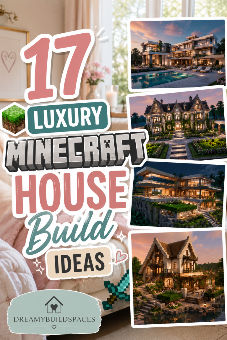
Idea 5: Luxury Marble Palette — White, Gold & Elegant Gray Theme
The luxury marble palette is a high-end and sophisticated color combination inspired by modern luxury villas, mansions, and elegant architectural interiors. It focuses on clean brightness, reflective surfaces, and premium visual balance.
The main idea behind this palette is luxury simplicity. It uses minimal colors but focuses on high visual impact through polished materials and refined contrast. This makes it perfect for modern mansions, palaces, and showcase builds.
White is the dominant base color in this palette. Quartz, white concrete, and smooth blocks create a clean marble-like surface that represents elegance and purity. This forms the foundation of the entire structure.
Gold accents are used to highlight luxury details. While Minecraft doesn’t have direct gold building coverage everywhere, gold blocks, honey-colored tones, or yellow accents can be used sparingly to create a rich decorative feel.
Gray tones balance the brightness of white and gold. Light gray concrete, stone, and polished andesite add structure and depth without breaking the luxurious theme.
Glass is also important in this palette. Large windows and transparent sections enhance openness and make the build feel modern and expensive.
Block Palette Breakdown
- Quartz blocks and white concrete
- Smooth stone and polished andesite
- Light gray concrete
- Gold blocks or yellow accents
- Glass panes or glass blocks
- Marble-style flooring (quartz mix)
- Sea lanterns for soft lighting
- Iron blocks for clean metallic detail
- White carpets or wool accents
- Minimal wood accents (light oak)
These blocks create a luxury mansion aesthetic.
How to Use This Palette in a House Build
Step 1: Build a Clean White Structure
Start with quartz or white concrete walls.
Step 2: Add Gray Structural Depth
Use gray tones for outlines and layering.
Step 3: Apply Gold Accent Details
Use gold sparingly for highlights and focal points.
Step 4: Add Glass for Modern Luxury Feel
Incorporate large windows and open spaces.
Step 5: Finish With Elegant Lighting
Use soft sea lantern lighting for a premium glow.
Styling Tips
This palette works best when kept minimal and controlled. Too many colors can ruin the luxury effect—focus on white dominance, subtle gold highlights, and clean gray structure.
Idea 6: Dark Medieval Palette — Stone Gray, Black & Deep Brown Fortress Theme
The dark medieval palette is a powerful and dramatic color combination inspired by ancient castles, fortress walls, and medieval survival builds. It focuses on strength, depth, and a slightly mysterious atmosphere.
The main idea behind this palette is raw power and defense. It is designed to make structures feel heavy, strong, and historically aged. This makes it perfect for castle bases, survival fortresses, and medieval towns.
Stone gray is the dominant base color. Stone bricks, cobblestone, and deepslate blocks create a solid and rugged foundation that gives the build its fortress identity.
Black tones are used to enhance depth and mystery. Blackstone, dark oak, and deep slate accents are used in roofs, trims, and structural shadows to create contrast and intensity.
Deep brown elements bring warmth and age to the palette. Dark oak wood and stripped logs help soften the harsh stone appearance and add medieval realism.
Lighting is usually minimal but strategic. Lanterns, torches, or dim glowing sources are used to create atmospheric highlights rather than bright illumination.
Block Palette Breakdown
- Stone bricks and cobblestone
- Deepslate and blackstone
- Dark oak wood and logs
- Andesite for texture variation
- Iron bars for medieval detail
- Wooden planks and stairs
- Lanterns and torches
- Mossy stone blocks for aging effect
- Dirt paths and gravel
- Deep gray concrete accents
These blocks create a strong medieval fortress style.
How to Use This Palette in a House Build
Step 1: Build Heavy Stone Foundations
Start with stone bricks or cobblestone.
Step 2: Add Dark Structural Layers
Use blackstone or deepslate for depth.
Step 3: Introduce Wooden Warmth
Add dark oak beams and accents.
Step 4: Create Fortress Details
Use iron bars, towers, and strong walls.
Step 5: Add Atmospheric Lighting
Use lanterns for subtle medieval glow.
Styling Tips
This palette works best when it feels heavy and aged. Avoid smooth modern shapes—focus on rough textures, layered stone, and fortress-like structure for maximum impact.
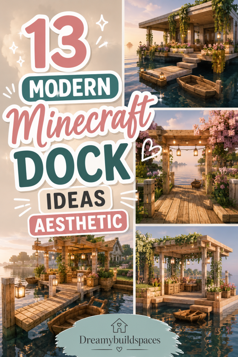
Idea 7: Ocean Breeze Palette — Aqua, White & Sand Coastal Theme
The ocean breeze palette is a fresh and calming color combination inspired by coastal houses, beach resorts, and seaside villages. It focuses on lightness, airiness, and natural ocean tones that make Minecraft builds feel open and relaxing.
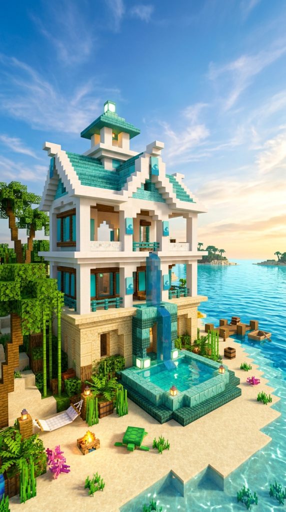
The main idea behind this palette is creating a peaceful coastal atmosphere. It uses soft blues and sandy neutrals to mimic the colors of the ocean, shoreline, and sky. This makes it perfect for beach houses, docks, seaside villas, and tropical survival bases.
Aqua and light blue tones form the emotional core of this palette. Prismarine, cyan concrete, and light blue blocks create a refreshing ocean-like feel that instantly makes the build feel connected to water environments.
White is used to balance and brighten the palette. Quartz, white concrete, and smooth blocks represent sea foam, sunlight reflection, and clean architectural surfaces. This keeps the build feeling open and modern.
Sand and beige tones ground the palette in nature. Sandstone, stripped birch wood, and light terracotta add warmth and prevent the design from feeling too cold or overly blue.
Block Palette Breakdown
- Prismarine and dark prismarine
- Cyan and light blue concrete
- Quartz and white concrete
- Sandstone and smooth sandstone
- Birch wood and stripped logs
- Glass panes for open views
- Sea lanterns for soft lighting
- Oak fences for coastal detailing
- Water features and pools
- Natural beach landscaping blocks
These blocks create a fresh coastal aesthetic.
How to Use This Palette in a House Build
Step 1: Build a Light Coastal Structure
Start with white or sandstone foundations.
Step 2: Add Aqua Water-Inspired Accents
Use prismarine and blue tones for highlights.
Step 3: Mix in Sandy Natural Elements
Add sandstone and birch for warmth.
Step 4: Open the Design With Glass
Use large windows for ocean views.
Step 5: Add Soft Ocean Lighting
Use sea lanterns for a clean glow.
Styling Tips
This palette works best when it feels open and breathable. Avoid heavy structures—focus on light materials, water integration, and smooth color transitions.
Idea 8: Forest Nature Palette — Green, Brown & Stone Organic Theme
The forest nature palette is a grounded and organic color combination inspired by deep forests, woodland cabins, and natural survival environments. It focuses on blending structures seamlessly into nature.
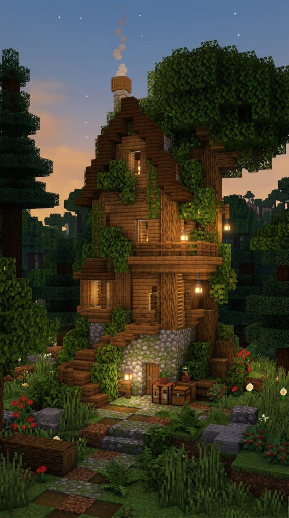
The main idea behind this palette is harmony with the environment. Instead of standing out aggressively, builds using this palette feel like they belong naturally in forests, mountains, or jungle areas.
Green tones are essential to this palette. Leaves, moss, vines, and greenery create life and softness in the structure. These colors help the build merge visually with surrounding nature.
Brown tones form the structural base. Oak, spruce, and dark oak wood provide strong natural framing that feels like a real forest cabin or ranger-style home.
Stone gray adds realism and durability. Cobblestone, stone bricks, and andesite are used to create foundations, pathways, and structural support, making the build feel grounded and stable.
Block Palette Breakdown
- Oak and spruce wood
- Dark oak logs and planks
- Cobblestone and stone bricks
- Mossy cobblestone and moss blocks
- Leaves and vines
- Grass blocks and dirt paths
- Stripped logs for variation
- Glass panes for natural windows
- Lanterns for warm forest lighting
- Ferns and natural plants
These blocks create a deep forest survival aesthetic.
How to Use This Palette in a House Build
Step 1: Build a Natural Wooden Structure
Start with logs and planks as the base.
Step 2: Add Stone Foundations
Use cobblestone for stability.
Step 3: Blend With Green Elements
Add moss, vines, and leaves.
Step 4: Integrate Into the Forest
Surround the build with trees and plants.
Step 5: Use Warm Natural Lighting
Place lanterns to create cozy forest vibes.
Styling Tips
This palette works best when it feels organic and unforced. Let nature influence the build instead of trying to overpower it—blending is the key.
Idea 9: Sunset Warm Palette — Orange, Pink & Gold Dream Theme
The sunset warm palette is a vibrant and emotional color combination inspired by golden hour skies, sunsets, and dreamy atmospheric lighting. It creates a visually warm and cinematic feel in Minecraft builds.
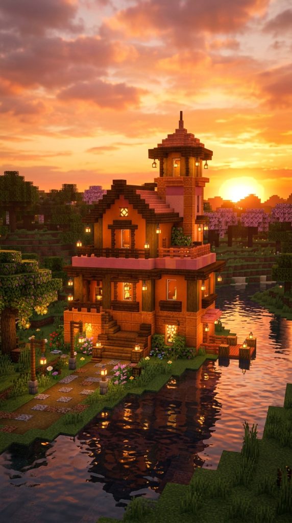
The main idea behind this palette is emotional warmth and visual glow. It uses warm tones that resemble sunset skies, making builds feel peaceful, nostalgic, and beautiful at any time of day.
Orange tones are the heart of this palette. Terracotta, orange concrete, and warm-toned blocks represent sunlight and glowing sky colors that give the build energy and warmth.
Pink tones add softness and dreamlike beauty. Light pink concrete, coral blocks, and subtle pastel accents create a gentle contrast that makes the palette feel romantic and aesthetic.
Gold and yellow tones enhance brightness and richness. Honey-colored blocks, glowstone, and warm lighting create a glowing effect that mimics sunset reflections.
Block Palette Breakdown
- Orange and terracotta blocks
- Pink concrete and coral
- Yellow and honey-toned accents
- Quartz for soft balance
- Oak wood and warm-toned planks
- Glass panes for glowing light effect
- Glowstone and lanterns
- Sandstone for warm base texture
- Wool or carpet accents
- Natural greenery for contrast
These blocks create a sunset-inspired aesthetic.
How to Use This Palette in a House Build
Step 1: Build a Warm Base Structure
Use sandstone or oak wood foundations.
Step 2: Add Orange Structural Layers
Incorporate terracotta and warm tones.
Step 3: Blend Pink Accent Details
Add soft pink highlights for contrast.
Step 4: Enhance With Golden Lighting
Use glowstone or lanterns for warm glow.
Step 5: Create Soft Atmospheric Balance
Add greenery and glass for variation.
Styling Tips
This palette works best when it feels soft and glowing. Avoid harsh contrasts—focus on smooth transitions between warm colors to create a dreamy sunset effect.
Idea 10: End Dimension Purple Palette — Void, Obsidian & Cosmic Glow Theme
The End Dimension purple palette is a mysterious and otherworldly color combination inspired by the End dimension in Minecraft. It focuses on dark void tones mixed with glowing purples to create a surreal, cosmic-style building aesthetic.
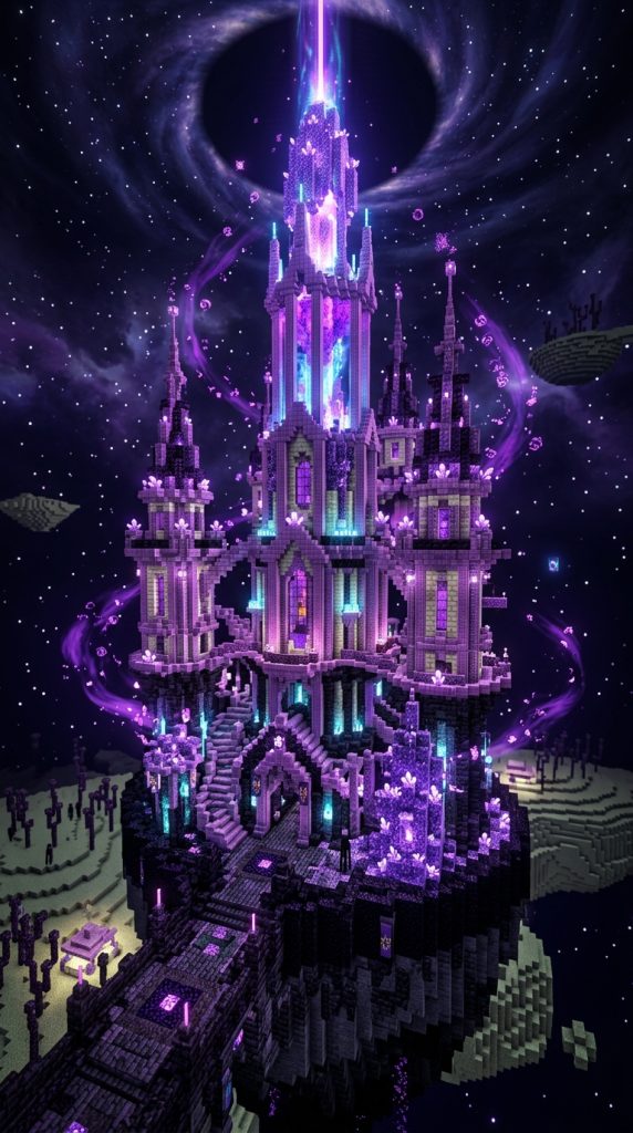
The main idea behind this palette is creating a sense of infinite space and mystery. It feels alien, magical, and slightly eerie, making it perfect for futuristic bases, End castles, and fantasy void structures.
Deep purple tones are the signature of this palette. Blocks like purpur, amethyst, and purple concrete create the glowing “energy” feel that defines the End aesthetic. These colors give the build a magical and dimensional look.
Obsidian and blackstone act as the foundation. These dark blocks represent the void and add strong contrast, making the purple elements stand out more dramatically.
Soft white and light accents are used sparingly to mimic stars or cosmic light. Quartz or sea lanterns help break the darkness and add glowing focal points throughout the structure.
Block Palette Breakdown
- Purpur blocks and purpur pillars
- Amethyst blocks and clusters
- Obsidian and crying obsidian
- Blackstone and deep slate
- Purple concrete and stained glass
- End stone and end bricks
- Sea lanterns for cosmic glow
- Quartz for contrast highlights
- Tinted glass for void effect
- Shulker-inspired color accents
These blocks create a powerful End-themed cosmic palette.
How to Use This Palette in a House Build
Step 1: Build a Dark Void Base
Start with obsidian or blackstone foundations.
Step 2: Add Purple Core Structures
Use purpur and amethyst for main design elements.
Step 3: Layer Cosmic Accents
Add glowing purple details and glass highlights.
Step 4: Create Depth With Darkness
Use black tones to enhance contrast and void feeling.
Step 5: Add Star-Like Lighting
Place sea lanterns or hidden lights for glow effects.
Styling Tips
This palette works best when it feels infinite and mysterious. Focus on contrast between darkness and glow to create a true End-dimension atmosphere.
Idea 11: Pastel Dream Palette — Soft Pink, Blue & Cream Aesthetic Theme
The pastel dream palette is a soft, calming, and visually gentle color combination inspired by aesthetic builds, dreamy interiors, and modern cozy designs. It focuses on light colors that create a peaceful and visually pleasing atmosphere.
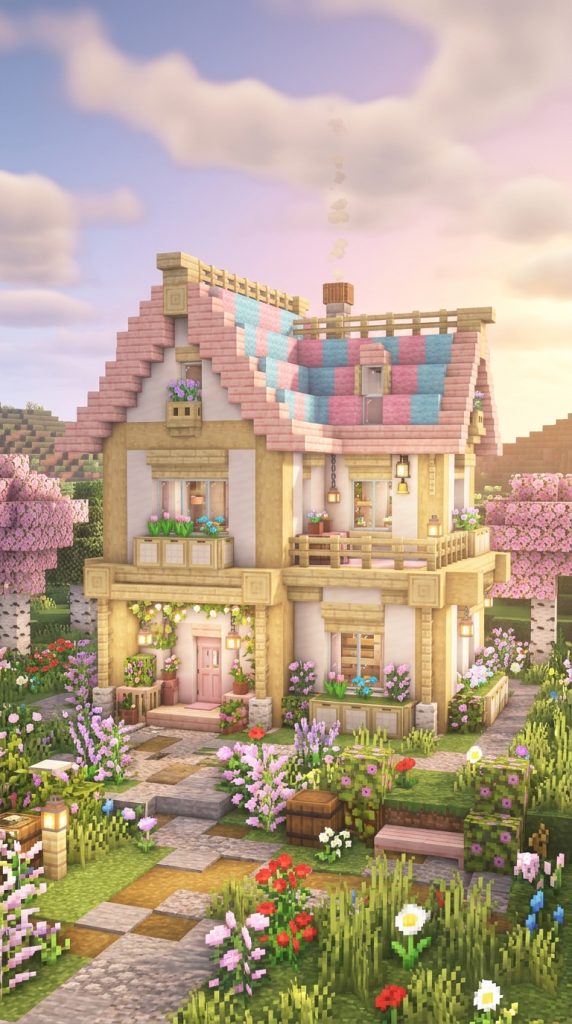
The main idea behind this palette is softness and comfort. It is designed to make builds feel cute, cozy, and relaxing, making it perfect for aesthetic houses, creative builds, and decorative interiors.
Soft pink is a key color in this palette. It brings warmth, charm, and a gentle emotional tone that makes the build feel welcoming and cute. Pink concrete, wool, or terracotta are commonly used.
Light blue adds freshness and calmness. It balances the warmth of pink and creates a peaceful sky-like feeling throughout the build.
Cream and white tones act as the base. Quartz, white concrete, and light wood help keep the palette clean and bright without overwhelming the pastel colors.
Block Palette Breakdown
- Pink concrete and pink wool
- Light blue concrete and cyan accents
- Quartz and white concrete
- Light oak and birch wood
- Glass panes for airy feel
- Smooth sandstone for warmth
- Pastel terracotta variations
- Sea lanterns for soft glow
- White carpets and rugs
- Light greenery accents
These blocks create a soft aesthetic pastel palette.
How to Use This Palette in a House Build
Step 1: Build a Light Neutral Base
Start with white or cream foundations.
Step 2: Add Pastel Main Colors
Use pink and blue as primary accents.
Step 3: Balance With Cream Tones
Mix quartz or birch to soften contrast.
Step 4: Add Soft Decorative Details
Use flowers, carpets, and small decor items.
Step 5: Use Gentle Lighting
Add soft lights for a cozy glow.
Styling Tips
This palette works best when it feels light and airy. Avoid dark blocks or harsh contrasts—focus on softness, harmony, and a dreamy visual flow.